

How to Choose Wine Packaging That Protects Quality and Builds Brand Appeal
2026-11-16
Every bottle tells a story before it’s even uncorked—your packaging decides whether that story gets noticed or left on the shelf. But choosing wine packaging isn’t just about looking good; it has to guard against light, oxygen, and temperature swings while quietly shaping how buyers feel about your label. Kody approaches this balance without the usual guesswork, so you can protect every pour and give your brand a sharper edge.
Start With the Bottle Itself
Ignore the labels, the shelf position, the brand history. Pick the bottle up and notice its weight, the shape of the shoulder, the way the glass catches dull light. A bottle built for slow nights tends to have a certain heft, a base that sits without wobble, a neck that doesn't fight your thumb. These details don't get mentioned on the back label, but they tell you more about how a maker thinks than any tasting note ever could.
Look at the fill level and the cork or cap. A slight indentation at the top of the cork, a clean seam along the glass, a label that's been pasted by hand rather than machine — none of it is accidental. Cheap shortcuts show up first in the parts no one photographs. When the bottle itself feels considered, the liquid inside rarely disappoints.
Weigh Shipping Conditions Before Aesthetic Choices
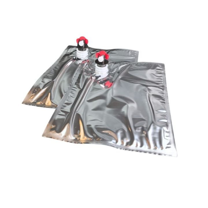
Shipping rarely rewards the most beautiful option. A surface that scuffs under strapping, a corner that chips when boxes shift, or a material that warps in humid transit can undo the visual impact long before a customer opens the package. It helps to treat durability as part of the design brief rather than an afterthought.
Decisions about weight, stackability, and protective clearance often shape the final look more than color or texture do. A slightly thicker edge, a recessed face, or a matte finish chosen for its resistance to abrasion can preserve the intended appearance without needing excessive packaging. When the physical journey is considered early, the aesthetic choices that remain are the ones that actually survive.
Turn Unboxing Into a Brand Moment
Unboxing is one of the few moments where a customer willingly slows down and pays full attention to your product. Most brands treat the box as a disposable shell, but the smart ones treat every fold, insert, and piece of tape as a scripted scene. The first layer shouldn't just protect the item; it should set a mood. A heavier-than-expected box, a subtle resistance when opening the lid, a tucked-in note that says something specific instead of “thank you” — these small details make the customer feel like the package was meant for them, not stamped out by the thousands.
The mistake is trying to impress with loud logos or excessive filler. That reads as marketing, and marketing is what people skip. Instead, think of unboxing as a private handshake. Use materials that feel different from standard e-commerce packaging — a soft-touch card, a single color printed on the inside flap, a reusable sleeve instead of a throwaway carton. When the customer pauses to show someone else or reaches for their phone to photograph the spread, you’ve created a brand moment without saying “brand moment.”
What people remember is rarely the product shot on the box. It’s the way the tissue paper crinkled, the tiny sticker sealing the inner bag, the handwritten code on the back of a card that leads to a hidden playlist or a discount for the next order. Those details cost pennies but communicate something larger: that the company cared enough to choreograph a minute of someone’s day. That feeling gets shared, repeated, and attached to your name long after the cardboard is gone.
Let Closure and Seal Do the Quiet Work
A good closure never asks for attention. The best designs let the cap, gasket, or seal disappear into the routine of opening and closing, holding pressure and keeping out moisture without ever making a sound. That quiet reliability matters more than any visible feature.
What makes it work is usually hidden in small decisions: the way a lip flexes just enough to stay engaged, the slight interference that keeps a ring from backing off, the material memory that lets a seal recover after years of use. None of it photographs well, but all of it is felt the first time something stays tight and dry without extra force.
When closure and seal do their job properly, the product feels simpler than it actually is. There is no need to check, retighten, or worry. The work is still happening—just below the surface, where it belongs.
Match Materials to the Wine’s Personality
Think of material as the frame around a painting. A high-acid, aromatic white like Albariño feels sharper and more precise in a thin-rimmed glass, while a dense, tannic Syrah softens in a broader bowl with a slightly thicker lip. Crystal, with its fine texture, tends to flatter delicate wines; everyday glass can mute aromatics just enough to make bold reds feel more relaxed. It is less about price and more about how the surface carries the wine to your mouth.
Storage and serving vessels follow the same instinct. Stainless steel keeps a clean, citrus-driven wine bright and unadorned, while oak adds structure, toast, and a faint sweetness to reds that can handle the extra weight. Concrete or clay gives wines a quiet, mineral edge, which suits varieties that already lean savory. If the wine feels shy or tight, a wide-bottomed decanter made of lead-free crystal gives it air and room; if it is fragile and old, a narrow glass or porcelain cup can keep its energy from scattering.
Design for the Shelf, Not Just the Cellar
A bottle that looks handsome in a dim cellar can disappear on a brightly lit retail shelf. The same label that feels understated beside a rack of vintages often reads as timid when surrounded by louder, busier packaging. Designing for the shelf means accepting that most buyers make a decision in seconds, from arm's length, while the bottle sits at eye level next to twenty competitors. Clarity of hierarchy matters more than cleverness: the name, region, and varietal need to be legible before any story gets told.
This does not mean chasing bright colors or gimmicks. Strong shelf presence can come from a restrained color field, an unusual silhouette, or a typographic system that stays consistent across the range. Small details like the edge of a label, the weight of a capsule, or the way light hits a textured paper become tools when the bottle is seen in a horizontal row rather than held in hand. Test the design at actual shelf distance, under store lighting, next to bottles that share the same price band.
Cellar-worthiness and shelf appeal should not be treated as opposites. A well-designed package can age gracefully in a collection while still holding its own on the retail floor. The key is building a visual idea strong enough to work at a glance and subtle enough to reward a closer look later.
FAQ
Focus on oxygen control first. Dark glass, reliable closures, and proper fill levels matter more than any decorative element. For most still wines, a deep punt and a snug capsule help shield the cork from temperature swings, while bag-in-box or cans work well for wines meant to be consumed young.
Yes, especially for whites and rosés. Clear or flint glass lets in more UV light, which can degrade aromas and create off flavors. Amber or dark green glass blocks more of that light. If you want a clear bottle for visual appeal, consider a UV-protective coating or keep turnover fast.
Start with the bottle silhouette and weight. A custom mold may cost more, but a shape that feels good in hand can signal quality before the wine is poured. Then let the label and closure do the branding work without compromising the bottle's protective features. Avoid overly thin glass if distribution involves long hauls.
It depends on the wine style and audience. Natural cork still carries tradition and suits age-worthy reds, but it brings cork taint risk. Screw caps preserve freshness and are easier for everyday wines, and many premium producers now use them without losing credibility. Glass stoppers or technical corks can offer a middle path.
The neck fill height and the seal under the capsule. Too much headspace allows oxidation; a poor seal lets air in slowly. Also look at case dividers and pallet stacking because vibration and heat during transport can undo what the bottle itself does well. Think beyond the bottle to the full shipping unit.
Use restraint. A simple off-white or textured paper label with one strong visual cue can feel more expensive than busy foil stamping. Consistent typography, a heavier bottle from an existing stock range, and a capsule color that matches the label all lift perceived quality. Small runs of embossing or debossing often cost less than full custom glass.
Label material sets the first tactile impression. A cotton or estate paper feels warmer and more artisanal, while a coated stock resists moisture in ice buckets and cold rooms. If the bottle will sit in a fridge or wine cooler, a waterproof adhesive and laminate prevent peeling and staining, keeping the bottle looking sharp on the shelf.
Conclusion
Packaging decisions tend to get pushed to the end of a wine project, but the bottle itself shapes how well the wine survives heat, vibration and time. A heavier, thicker glass can feel premium, yet it may crack under courier handling if the shipper hasn’t planned proper dividers, pulp trays or outer carton compression. The tint of the glass matters too: darker green or amber protects delicate whites and rosés from UV damage, while clear flint can work for fast-turnover wines displayed away from sunlight. Around the neck and crown, the closure quietly determines oxygen ingress. A technical cork, natural cork or screw cap should be chosen not by trend but by how the wine is meant to age, and the capsule should stay clean enough to reveal any seepage before a customer ever pulls the cork.
Once the bottle arrives safely, packaging should become part of the brand memory. Unboxing works best when it feels personal rather than promotional: a simple tissue wrap, a small note tucked into the carton or a label texture that invites touch can say more than a glossy sales line. The materials should match the wine’s personality—textured cotton stock suits an old-vine red, while a low-intervention white might call for recycled, uncoated paper and minimal ink. At retail, the package has to perform: a label that is readable at arm’s length, a consistent color block across the range and a silhouette that holds its own on a crowded shelf often do more for brand appeal than clever copy or loud foil accents.
Contact Us
Contact Person: Cindy Lee
Email: [email protected]
Tel/WhatsApp: 8613622669331
Website: https://www.dgkody.com